Poro
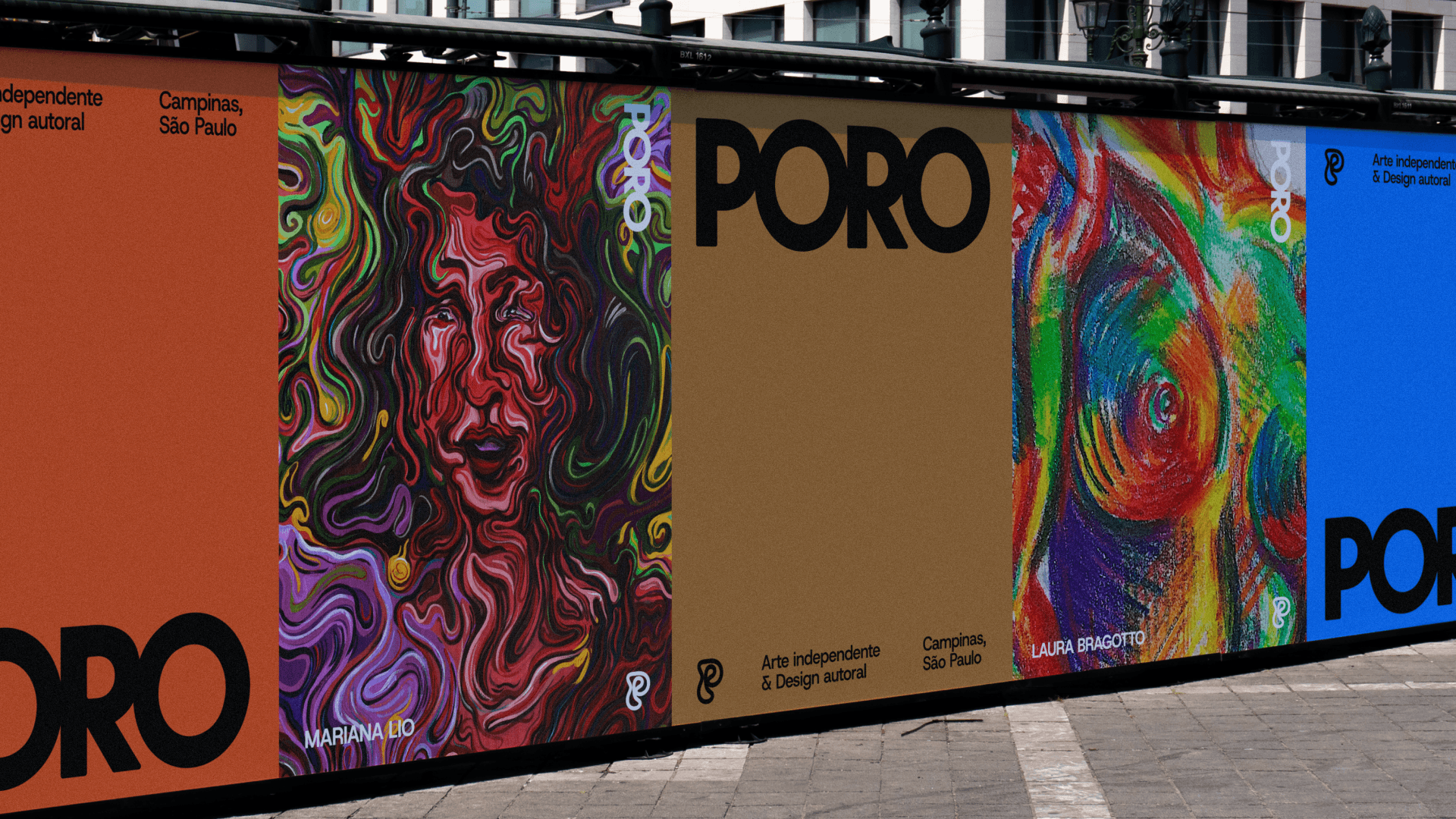
PORO is a meeting place for art, design, fashion, and community. Both a store and a gallery, it brings together a distinctive, collaborative curatorial approach that champions independent artists and connects people with artistic creation. A place to discover, exchange ideas, and experience art together.
How could we represent a space that brings together so many forms of expression without limiting its identity to a single language? The challenge was to balance diversity and recognition: to create a brand with a distinct presence, capable of embracing different artistic worlds while keeping its communication approachable, accessible, and consistent.
The concept began with the pore as a point of passage, breathing, and exchange. This idea took shape in a visual system of vibrant colors, modular patterns, and compositions that explore rhythm and contrast.
Scope of Work
Brand Strategy
Visual Identity
Motion Design
Client
Poro
Year
2024
The concept began with the pore as a point of passage, breathing, and exchange. This idea took shape in a visual system of vibrant colors, modular patterns, and compositions that explore rhythm and contrast.
The logotype is paired with a continuous-line symbol that forms the letter “P,” bringing an organic quality and a sense of movement. Across stationery, posters, and digital communication, the identity unifies different content while leaving room for new combinations and expressions. Always in motion.